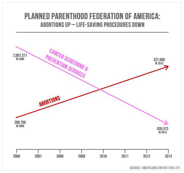
Remarkably dishonest graph. The two lines are on completely different vertical scales, which would be somewhat dishonest if both scales were labeled and started at zero, and more dishonest if they were labeled and did not start at zero. This is worse - unlabeled, and different start points, so both the position and slope of the lines is completely arbitrary. 900000 < 300000? The pink line goes down (by the numbers) about 50%, but the slope of the line is about the same as the brown line, which goes up a bit over 10%?
And why cancer screenings? It's not like Planned Parenthood only does cancer screenings and abortions. Answer - because cancer screenings have been downplayed in recent years, and decreasing them has been suggested by major medical groups. So it's
one of the few things they do that has gone down over that period.
And, related to both issues above - they only took two data points, 2006 and 2013, but put all of the intervening years on the horizontal scale. This makes it seem as if the rates were (at least somewhat) constant. A more granular line might (note that I haven't actually seen a more granular version, so this is hypothetical) show, for example, the year(s) that cancer screening policies might have changed, which would lead to explanations.