|
August 5th, 2018: Packaging makeover of K-Rations
In the latter part of World War II they spiffied up the packages as a moral booster.
They added color as a claimed moral booster, but with the shit getting heavy at that point made it easier to grab the right meal for the enemy's circadian rhythm.
Quote:
|
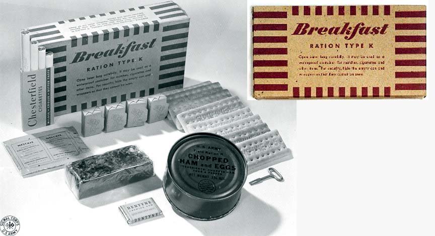
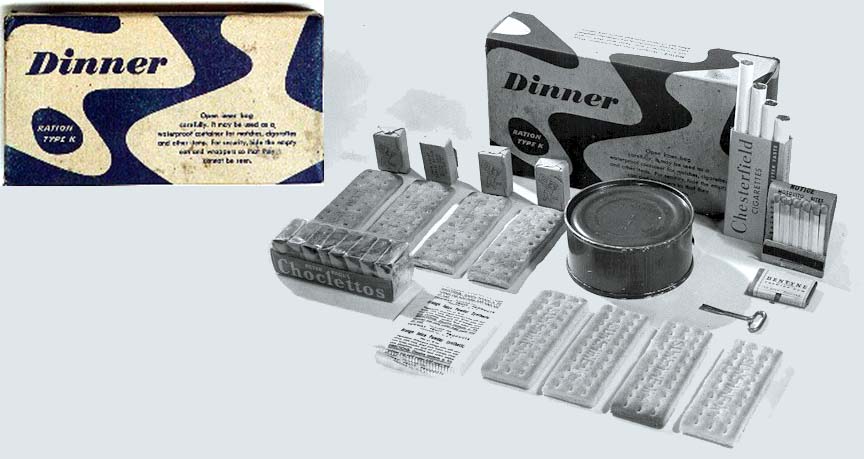
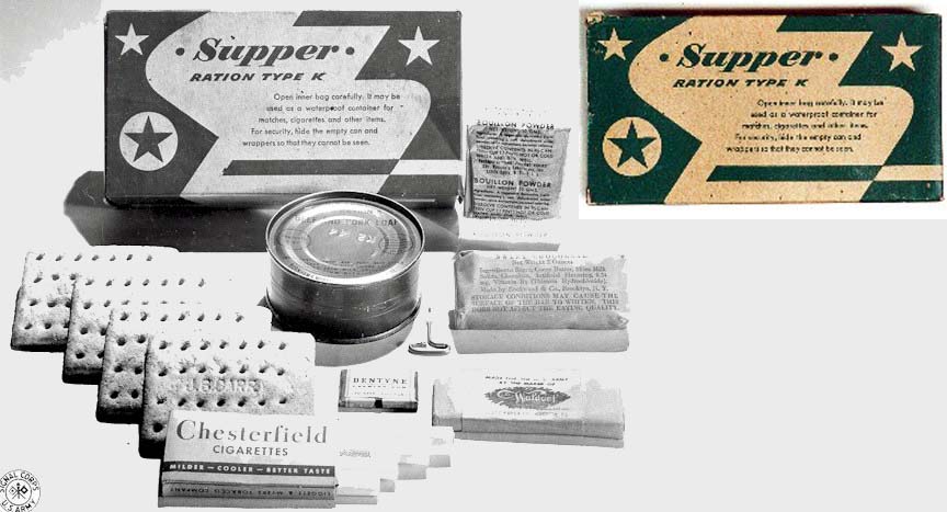
Rations Type K were developed by inventor and public health scientist, Ancel Keys, which may (or may not) explain the K in K-Ration. (There is debate about that.) The boxes were manufactured by the Cracker Jack company and were similar in size and material to Cracker Jack boxes.
|
Quote:
|
Originally the packages were generically labeled: Breakfast, Dinner and Supper. Towards the end of the war they were redesigned (as part of a morale initiative) to make the three meals more easily distinguishable with 3 new color-coded / pattern-coded designs.
|
Quote:
|
Who handled the graphic design? Some anonymous, government-employed graphic designer? An advertising agency of the time? K-Ration boxes were featured in the Brooklyn Museums 2001 exhibit, Vital Forms: American Art and Design in the Atomic Age, 1940-1960, as one of many examples illustrating the impact of organic form on graphic design.
|
link
__________________
The descent of man ~ Nixon, Friedman, Reagan, Trump.
|