
|
|
|
What's IotD? The interesting, amazing, or mind-boggling images of our days. |
|
IotD Stuff |
|
Permalink Latest Image |
|
|
|
Some folks who have noticed IotD
Neatorama |
|
Common image haunts
Astro Pic of the Day |
|
Advertising |
11/6/2004: Visual display of the electoral divide
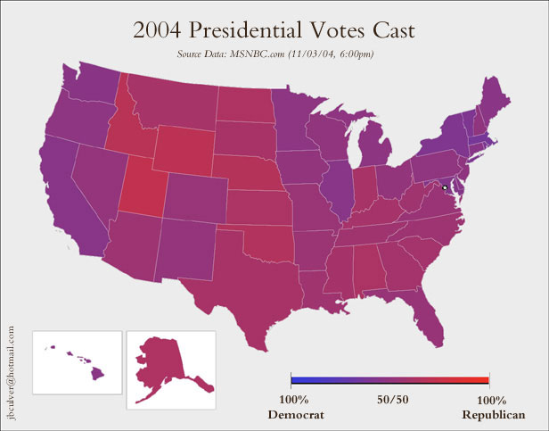
Is the US a horribly divided country? Should panicky Kerry voters in "red" states move to "blue" states? Not at all.
We've all seen the red-blue state depiction... ad infinitum. Fans of Tufte's work on visual display of quantitative information may enjoy the differences between that approach, and the above.
The above shows us an entirely different view of the country, but one that's more meaningful to the character of the country than the standard red-blue. The standard shows us red, if the divide is 51% red, 49% blue, and vice-versa. The above shows that divide exactly as it is.
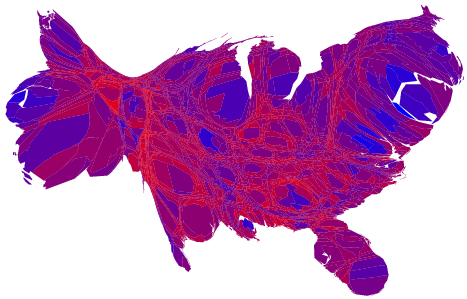
This guy has produced the same "purple" county-by-county, too large to link here directly, but it's a beautiful thing.
Compare those maps to to this one:
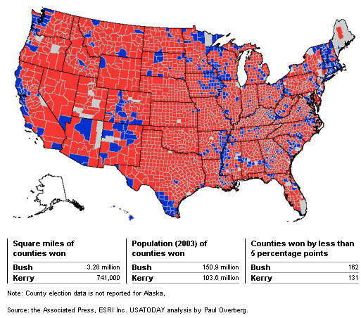
This one is being used by R folks to suggest that the red-blue divide in the country is deeper than it is, and that the country is actually much more red than blue. Not the case; it's merely the wrong way to display the results. The above map tells you nothing because it biases for geographic area taken up in an election that divided urbanites against suburbanites and ruralites. The blue areas look small, but the appearance is deceiving; it's only because the people there are concentrated into a small area.
This gentleman has corrected for that problem, and produced cartograms, where the visual size of the counties is adjusted for their population size. That produces a very strange-looking graphic indeed, but it's actually more accurate in many senses than the red-blue county map.
jaguar Saturday Nov 6 12:15 PM
Facinating stuff, the last maps you linked to are interesting indeed. However, I don't see what this has to do with divisions in the community.
Cyber Wolf Saturday Nov 6 12:33 PM
There should be a push for more maps like these to be used to show how the country voted. It shows the greys between straight up R or D. Just because one of them won a state or a community doesn't mean EVERYONE in that area voted that way. Also, these maps over time could better show how the country's tendencies shift and move. I'd love to see something like this animated with data spanning 10 or 20 years or so. These are good maps. Very good. 
richlevy Saturday Nov 6 01:10 PM
The funny thing about the cartogram is that it looks like a standing eagle with outstretched wings.
xoxoxoBruce Saturday Nov 6 08:14 PM
Sound bites for the eyes? Eye bites? 
richlevy Sunday Nov 7 12:40 PM
|
Originally Posted by xoxoxoBruce
Sound bites for the eyes? Eye bites?
|
In the chart you see the thick band of French marching towards Moscow and the thin band of survivors limping home.
Elspode Sunday Nov 7 12:59 PM
My History teacher in high school was also the French teacher. In addition to her bifurcated educational responsbilities, she was also the Staff weirdo. She claimed, for example, that she had worked her way through college as a prostitute, and she insisted that everyone call her Madame Schwartz...even those not taking French.
One of her favorite historical anecdotes was this: she claimed the French army lost to the Russians because they didn't know how to crap in the snow, and so froze their anuses and died from the subsequent infections.
Yelof Sunday Nov 7 06:09 PM
|
Originally Posted by Elspode
My History teacher in high school was also the French teacher. In addition to her bifurcated educational responsbilities, she was also the Staff weirdo. She claimed, for example, that she had worked her way through college as a prostitute, and she insisted that everyone call her Madame Schwartz...even those not taking French.
One of her favorite historical anecdotes was this: she claimed the French army lost to the Russians because they didn't know how to crap in the snow, and so froze their anuses and died from the subsequent infections. |
Your history teacher sounds like she was cool, and to think I was impressed with mine because of his Gengus Khan "first man to come and go at the same time" joke.
Gengus Khan supposedly died while making love..ok it was risque for a Jesuit school!
Karenv Monday Nov 8 09:00 AM
The cartograms are difficult to read. I really like the linked county by county purple map- too bad that he can't do things like very pale red for rural Oklahoma and really intense blue for New York City, so we can get a sense of the vote strength.
As it is, any graphic representation on a map will overestimate Republican strength because at this time Democrats are concentrated in the cities and cities are a LOT more dense than rural areas.
LabRat Monday Nov 8 11:26 AM
the cartograms reminded me of the homunculus (hoe-munn-Q-luss), a representation of our bodies based on the number of sensory neurons in the brain for each area. Cool.
Silent Monday Nov 8 01:07 PM
Based on how much time we spend thinking about it, I'm suprised the naughty bits aren't larger....
wolf Monday Nov 8 02:07 PM
and there are a fair number of sensory neurons there too ...
Happy Monkey Monday Nov 8 03:10 PM
The homunculus representation just represents the quantity, not the quality!

Happy Monkey Tuesday Nov 9 11:15 AM
This one looks sorta like a fish...
Kitsune Tuesday Nov 9 01:01 PM
Based on how much time we spend thinking about it, I'm suprised the naughty bits aren't larger....
That's because the homunculus LabRat posted is the motor cortex representation, not the somatosensory one.
xoxoxoBruce Wednesday Nov 10 07:56 PM
|
Originally Posted by Kitsune
That's because the homunculus LabRat posted is the motor cortex representation, not the somatosensory one.
|

Urethra Wednesday Nov 10 09:29 PM
There's more information about those maps at Wikipedia . And another version here.
I like Cyber Wolf's idea about making an animated version for the last 20 years or so. The results would be very interesting.
Griff Thursday Nov 11 07:55 AM
Maybe next election cycle we can get a map of voting by street address. 
axlrosen Thursday Nov 11 10:06 AM
|
Originally Posted by Kitsune
Based on how much time we spend thinking about it, I'm suprised the naughty bits aren't larger....
That's because the homunculus LabRat posted is the motor cortex representation, not the somatosensory one. |
BTW I Googled the somatosensory homonculus, and he looks even weirder...

wolf Thursday Nov 11 12:33 PM
Okay, so it's in his left hand or what?
jaguar Friday Nov 19 12:53 PM
Here is another wa of looking at it:
Urban Archipelago
With any luck it'll catch on.
Happy Monkey Friday Nov 19 02:40 PM
Good article. A little strident on religion, which will probably turn a few people off, though I personally agree.
Torrere Sunday Nov 21 11:06 PM
orcinculs penis
I wonder how a whale penis would show up on the whale equivalent of a somatosensory homunculus.
BigV Wednesday Nov 24 04:35 PM
Regarding the red/blue maps...
I agree that the oversimple party choice color / state outline (or county outline for that matter) presents a greatly distorted impression that our nation is waaaay more "red" than "blue". But still controlling for that by using the same state by state map and using the same color scheme, I found a very interesting observation with respect to Federal Tax distributions.
I googled up "donor states federal taxes" and found several links that contained maps that bore a striking resemblance to the electoral map.
Try it for yourself and see. Several theories come to mind explaining the similarities.
Yours--
xoxoxoBruce Wednesday Nov 24 10:02 PM
Aw c'mon BigV, you already did it, post the damn link(s).
And welcome to the Cellar. 
BigV Monday Nov 29 02:45 PM
Hello Bruce,
Thanks for the welcome. I refrained from posting the links not because I am coy, but because the "rules" warn that first posts containing links get forwarded to the twilight zone, and I wished to avoid that fate. My apologies for the obliqueness of the post.
Here are some sample images I found. (I hope)
*whew*
Top image, red states=beggar states, blue states=donor states for federal tax dollars
bottom image red states=beggar states, green states=donor states, gray states=neutral ($1 collected:$1 received)
Happy Monkey Monday Nov 29 03:01 PM
I think that the top image is the 2000 election, not a beggar/donor map.
Undertoad Monday Nov 29 04:27 PM
That second map looks like where the rich people live. With the exception of Virginia, which is where the rich people live who know how to get tax breaks.
BigV Monday Nov 29 04:40 PM
Negative. Here is the link containing the map image.
http://taxprof.typepad.com/taxprof_b...ates_feed.html
And the second one.
http://melvinfrohike.dailykos.com/st...1/15/12918/784
Yours,
Happy Monkey Monday Nov 29 04:43 PM
I wouldn't put the midwest in the "rich people haven" category. In fact, at least one rich person from Illinois (Ditka) didn't run against Obama in part because he'd have to move his legal residence from Florida.
Undertoad Monday Nov 29 04:51 PM
One of the links Kos points to explains it:
|
One factor affecting rankings is that federal spending on defense and other procurement dollars are often funneled to the states of powerful members of congress. Also, state governments can grab more federal grant money by manipulating their spending to comply with federal regulations. Another factor is demography. States with more residents on Social Security, Medicare and other federal entitlements tend to rank high. Similarly, high spending levels in Virginia, Maryland and the District of Columbia are explained by the predominance of federal employees. Finally, states with higher incomes per capita�such as Connecticut�pay higher federal taxes per capita thanks to the income tax's progressive structure, which increases federal taxes per dollar of federal spending received in return. |
Happy Monkey Monday Nov 29 05:15 PM
Or the first paragraph (you only covered the second and third).
Undertoad Monday Nov 29 05:56 PM
Well, just look at the damn map.
xoxoxoBruce Monday Nov 29 07:32 PM
|
Originally Posted by BigV
Negative. Here is the link containing the map image.
http://taxprof.typepad.com/taxprof_b...ates_feed.html And the second one. http://melvinfrohike.dailykos.com/st...1/15/12918/784 Yours, |
Now look at your first link....The text describes which states are beggars and donors compared to the map which is the 2000 election. Notice NM is blue but it's #3 on the beggar list.

xoxoxoBruce Monday Nov 29 07:46 PM
|
Originally Posted by Undertoad
Well, just look at the damn map.
|

Sorry UT, I couldn't resist.
modernhamlet Thursday Dec 23 01:58 AM
|
Originally Posted by richlevy
Actually, the process of juxtaposing charts with maps goes back at least to Charles Minard in his graphical explanation of the losses to the French army in Russia.
In the chart you see the thick band of French marching towards Moscow and the thin band of survivors limping home. |
lookout123 Tuesday Jul 1 04:42 PM
another fine bump brought to you by the random thread generator. Timely too, no?
BigV Tuesday Jul 1 07:04 PM
Indeed.
My first post in the cellar, ever. Post #24. *snif* [/nostalgia]
|
Your reply here?
The Cellar Image of the Day is just a section of a larger web community: a bunch of interesting folks talking about everything. Add your two cents to IotD by joining the Cellar. |